Take a look of some of my proudest pieces below!
Featured Work
-

Columbia River Transboundary Water Governance & Ethics Symposium 2024
The fall of 2024, I had the pleasure of working with members from the University of British Columbia Okanagan to produce the first brand identity (logo, brand guide), printed poster materials, and the official 2024 pamphlet for the Columbia River Transboundary Water Governance & Ethics Symposium (CRTWGES)!
I am grateful to have created this body of work that honours both the spirit of environmentalism and academia. For the Symposium, I designed a comprehensive and visually engaging pamphlet that embodies the essence of water stewardship and cross-border collaboration. Using a clean and professional layout complemented by place-based illustrations and locally curated imagery, the final design enhances readability while paying tribute to the Columbia River Basin’s rich ecological heritage, and the great work being done across the continent.
All written content and speaker images sourced by the CRTWGES. Local imagery curated by Cetadora. Illustrations, layout design, and branding by Cetadora.
-

Columbia River Transboundary Water Governance & Ethics Symposium 2024
The pamphlet features an acknowledgements page, convention centre information, full 3-day agenda layout, speaker and participation information, and a thoughtfully designed backpage with a hand-drawn outline of the Columbia River basin.
-

Columbia River Transboundary Water Governance & Ethics Symposium 2024
For this project, I am pleased to have worked directly with researchers and members from University of British Columbia Okanagan and Gonzaga University. Other organizers and funders for this project include Sierra Club, World Youth Parliament for Water, Oregon State University, University of Washington, BosonHub, SSHRC, Bringing the Salmon Home, One River Ethics Matter, and the University Consortium on Columbia River Governance.
-

POLIS Wildfire Resilience Project
Design Notes:
53 page report designed and published May 2024.
The report displays captivating place-based imagery (curated by myself in collaboration with my team, the BC Wildfire Service, wildfire experts, practitioners, and local communities). I focused heavily on the use of professional yet contemporary typography, balanced hierarchy, and consistent colour schemes throughout--utilizing the brand identity I created for the Project. I love how the pops of fireweed pink, field greens, charcoal greys, and fir browns complement each other. I utilized thin lines to contribute to a bold and captivating appearance. Brand identity, layout, and graphics illustrated by me unless specified otherwise. All research content, hierarchy systematics, and graphic data by the POLIS WRP team.
About the Report:
This primer explores the new wildland fire reality in B.C., and is the first publication from the POLIS WRP. The authors describe the nature of the wildland fire situation in B.C., highlight implications for communities and ecosystems, and detail current approaches to wildland fire management from governments and civil society.
-

POLIS Wildfire Resilience Project
Design Notes:
3-page research report, designed and published July 2024.
I created the POLIS’ Lightning Explainer series to have a similar feel as the State of Wildfire report, evoking a clean yet professional feel, emphasizing clarity, style, and readability. I utilized earthy tones to reflect the consistent forest-inspired theme, along with ample negative space that contributes to an organized layout and easy navigation for the reader. The report features a unique-to-the-series lightning banner, an attractive data table, and hand-drawn lightning illustrations. Headings, font sizes, and colours are consistent and intentional throughout. All written research content and graphic data produced by the POLIS WRP team.
About the Explainer:
This first series installment explores the need for a whole-of-society approach that coordinates efforts within and beyond the provincial government. The authors describe how to unlock this cooperative and collaborative approach at a variety of scales and the shifts required to effectively increase wildfire resilience in British Columbia.
-

POLIS Wildfire Resilience Project
Design Notes:
3-page report designed for the Wildfire Resilience Project, created September 2024.
The second installment of the Lightning Explainer Series followed a similar format to the Whole-of-Society Explainer while featuring eye-catching imagery and a hand-illustrated map of the wildfire economic impact locations across British Columbia. Partner logos are displayed to demonstrate credibility and collaboration, styling for the series remains consistent, and text boxes are used to highlight certain sections such as the "About" section on the right-hand side. All written research content and graphic data produced by the POLIS WRP team.
About the Explainer:
This second instalment in the Lightning Explainer series describes the economic impacts of wildfires in B.C. Drawing on a examples from across the province, it explains how wildfires can affect regional economies across sectors, identifies the need for a sector-by-sector economic analysis to assist in decision-making, and offers recommended actions that can be taken now and in the future to reduce economic loss from wildfires.
-

POLIS Water Sustainability Project
Social media graphic created for POLIS, as they celebrated the federal government's announcement and investments for watershed health and security! Here I used local imagery, a Canadian watersheds map, newspaper-inspired typography, and vivid colour schemes to emphasize the story headline.
-

POLIS Project
Graphic made for new article involving POLIS' Oliver Brandes. I enjoyed using POLIS Water's brand colours, consistent typography, balanced negative space, and minimal lines to create this playful, attractive, yet informative design. The research article reveals that B.C.'s officials don't always know who is using groundwater, how much they're using, or where they're drawing from, and the abundant groundwater monitoring issues present.
-

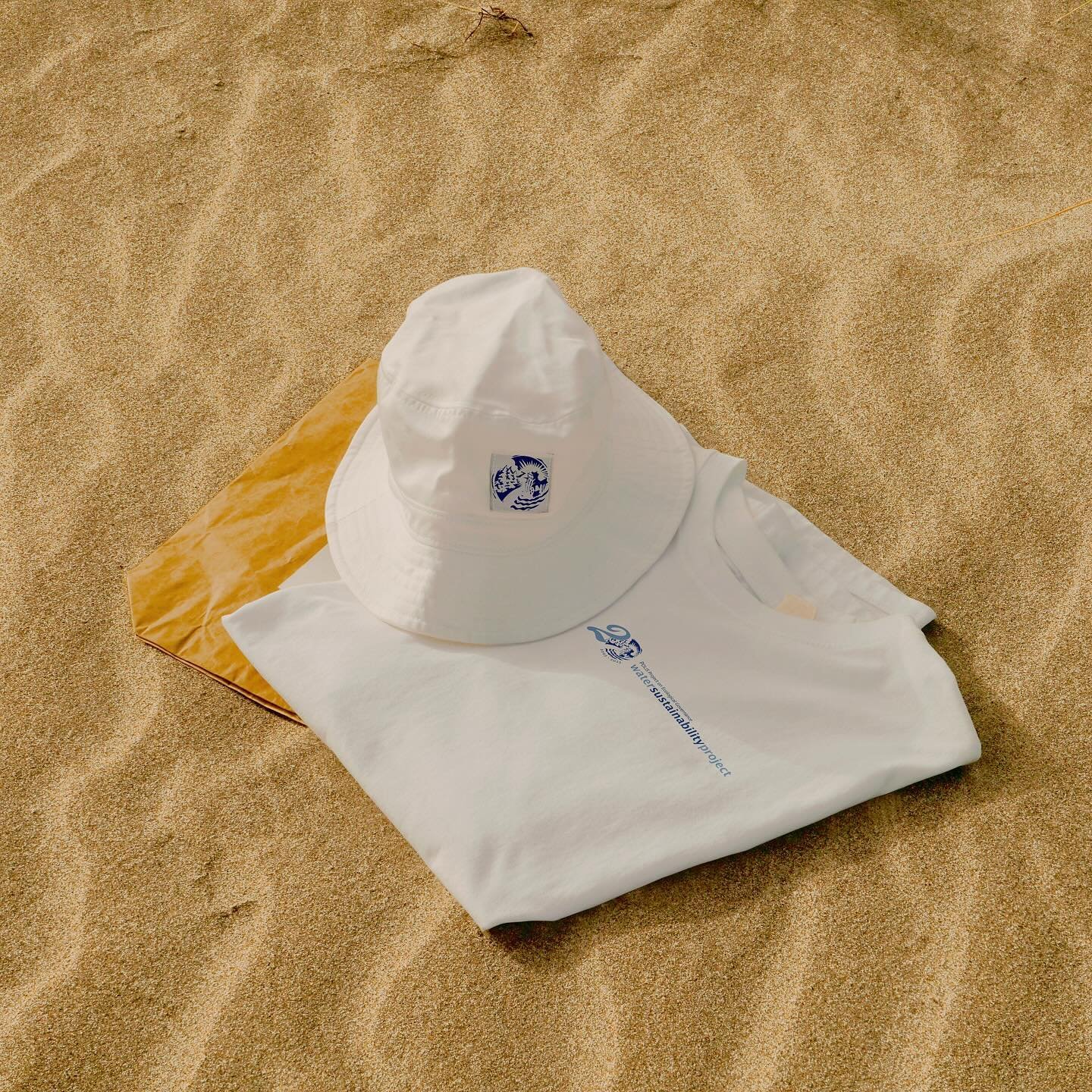
POLIS Water Sustainability Project
Merchandise and new logo designed for POLIS Water Sustainability Project's 20th Year Anniversary.
-

POLIS Project
Graphic made for POLIS' socials, after the POLIS Project's Senior Wildfire Analyst Doug Donaldson was featured in a new CTV Canada article. The story and video highlight British Columbia's record winter temperatures, low-snow packs, and subsequent cycle causing poor soil moisture, drought, and extreme wildfires.
-

POLIS Project
Graphic made for POLIS' socials, amplifying a summer institute for our colleagues at Borders in Globalization. The institute allowed participants to understand how ecological changes impact ecological borderland management, identify ecological risks to transnational borderland management agreements, and more.
-

MARS Wildlife Rehabilitation Centre
20 page Annual Report created for the MARS Wildlife Rescue team, located in Merville B.C.
I was lucky to work for MARS as a wildlife educator and social media manager in the summer of 2021!
-
Bay Spring Farms
Rustic brand identity created for Bay Spring Farms, located in Pass Lake, Ontario.
-

Coastal Campus
Tote and branding created for Coastal Campus, a creative and university-based brewery located in Comox, BC.
-

Coastal Campus
Locally inspired beer can illustrations and inspirational brewery art created for Coastal Campus. Includes hand-drawn elements of Hornby Island, Denman Island, and Comox Peaks.
-

Dr. Midori Barker ND
Full branding and web design created for Dr. Midori Barker, Naturopathic Doctor. Her new brand was created to reflect her warm, grounded, wellness-inspired, and naturally-radient self. Drawing inspiration from Lake Superior sands, lavender fields, and passion flowers, I created a light and familiar colour palette for the logo. I hand drew the uterus and period-inspired icon to resemble her areas of interest (PCOS, Hashimoto's thyroiditis, menstrual cycles), which complemented the custom 70's flow of her wordmark quite beautifully!
-

Dr. Midori Barker N.D.
This social media mockup for Dr. Midori blends her warm, inviting brand colours with educational resources to create a calming yet naturally inviting Instagram presence. The design also features relatable, uplifting imagery that speaks to mensturating individuals embarking on their wellness journey while maintaining a professional, trustworthy tone.
-

Dr. Midori Barker N.D.
The submark "Dr. MB" icon is simple but elegant, displaying her custom-made 'Midori Sans' typeface while reinforcing her brand’s approachable, playful, and trustworthy nature.
-

Area K. Residences
The branding and logo design created for Area K. Residences combines minimalist Scandinavian inspiration with clean, modern lines to reflect the sleek, sophisticated feel of the Florida real estate market. The simple, geometric icon of a house paired with bold typography conveys both elegance and functionality, while the neutral colour palette and open layout evoke a sense of warmth and serenity, aligning with the residential property’s aesthetic appeal.
-

Area K. Residences
This mockup for Area K. Residences features two logo variations, both embracing Scandinavian minimalism with sleek geometric forms and modern typography. One design highlights the architectural structure of a home, while the other emphasizes bold, clean text, both reinforcing a balance of simplicity and elegance to reflect the company’s Florida-based real estate identity.
-

Area K. Residences
Letterhead mockup for a residential lease created for the client.
-

Integrated Operations Group
The website created Integrated Operations Group showcases a clean, professional design that highlights the company’s expertise in forestry, commercial thinning, and fire mitigation services. It emphasizes their values of innovation, team collaboration, and world-class forestry practices, while also providing clear sections for services, career opportunities, merchandise, and contact information. The design incorporates west-coast themed imagery and a user-friendly layout, making it both informative and visually appealing for potential clients and job applicants alike.
-

Integrated Operations Group
A sturdy and polished glass mug designed with IOG's vivid logo on both sides.
-

Integrated Operations Group
Innovative forestry illustration custom made featuring a west-coast harvester and heli scene.
-

Integrated Operations Group
Commercial thinning illustration designed to complement any look with IOG's front logo and rustically illustrated art piece on the back. Features their favourite harvester and forwarding equipment.
-
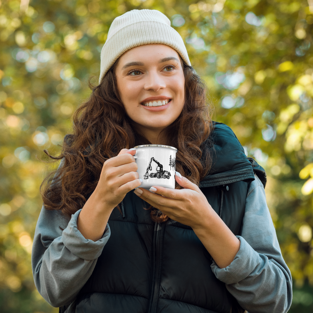
Integrated Operations Group
Custom illustrated vintage metal camping mug designed to feature piled short-logs, heli, the IOG logo, single-stem logging, and forwarding equipment.
-

Integrated Operations Group
Eye-catching custom t-shirt illustration of Vancouver Island, made to resemble IOG's west coast Vancouver Island base using their brand colours and coastal conifer outlines.
-

Integrated Operations Group
One of my first merchandise designs ever! Features a combination of clean and minimal mountain and Vancouver Island illustrations, along with IOG's founding years, location and name.
-

Integrated Operations Group
Crew-inspired hoodie illustration featuring the traditional cross-axe, conifer, and icon illustrations in a circular back frame with IOG's founding years.
-

EcoSuperior Environmental Programs
Example of my social media management and gridline style capabilities. Social media campaigns designed and published for Instagram during my time with EcoSuperior, circa 2020.
-

EcoSuperior Environmental Programs
Working alongside developers at Sencia, I designed the wireframes, web copy, and imagery for EcoSuperior's new website in 2019. The website offers educational initiatives on energy efficiency, waste reduction solutions, and the health risks of radon, contributing to a healthier community for Northwestern Ontario and surrounding areas.
-

EcoSuperior Environmental Programs
Hand-illustrated graphic for EcoSuperior's climate change forum in Thunder Bay, Ontario, circa 2020.
-

EcoSuperior Environmental Programs
Social media carousel designed for a pill-bottle recycling program in collaboration with Earthub & M25M, circa 2021.
-

EcoSuperior Environmental Programs
Graphic created for the City of Thunder Bay and EcoSuperior, for the 2021 election day.
-

EcoSuperior Environmental Programs
Graphic designed for the City of Thunder Bay and Earth Care Thunder Bay, promoting collaboration for their Net Zero Strategy in 2021.
-

EcoSuperior Environmental Programs
Carousel graphic designed for EcoSuperior and the City of Thunder Bay's commuter challenge to reduce greenhouse gas emissions by walking, biking, ride-sharing, and busing to commute.
-

EcoSuperior Environmental Programs
Carousel graphics designed for EcoSuperior, promoting International Compost Awareness Week.
-

Pengram Pengram
Illustration created in collaboration with Pengram Pengram and Losso Type, 2023.
-

Cetadora Tee
The 'Everything Connected Tee' features hand-drawn chinook salmon, while encompassing mystic elements and intentional phrases regarding human to ecosystem interconnectivity.
I chose chinook salmon as their lifecycles are foundational for the Pacific Northwest, specifically being a key food source for a variety of life, providing critical nutrients for ecological processes, and having important cultural values to communities (learn more here).
Soon available in our store - Launch TBA.
-

Everything Connected Tee
Backside view - model worn.
-

Everything Connected Tee
Front - Cetadora chest badge.
-

Cetadora Design Studio
Mockup tote-bag created for Cetadora's store, launch TBA.